In a world where attention spans are shorter than a goldfish’s memory (okay, maybe we’re not all in Finding Dory territory, but we’re getting there!), being forgettable is the ultimate sin for any brand. Whether you’re a startup or a seasoned player, blending into the background is a one-way ticket to oblivion. Let’s dive into the nuances of branding, dissect what makes a brand truly memorable, and why our Patch Design team knows that standing out is non-negotiable.
The Art of Being Memorable
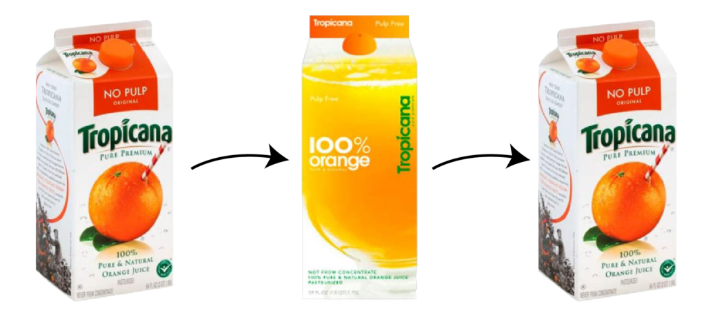
Remember when Tropicana decided to redesign their iconic orange juice packaging back in 2009? Yeah, neither did most people, which is lucky because it was a disaster! The brand replaced its familiar orange-with-a-straw image with a generic glass of orange juice. Maybe the big wigs didn’t find the orange as a-peel-ing as they used to! 😀. But the result was no laughing matter! Tropicana experienced a 20% drop in sales in just two months which prompted a swift return to the old design. The lesson? Mess with a memorable brand at your own peril.
The Power of Consistency
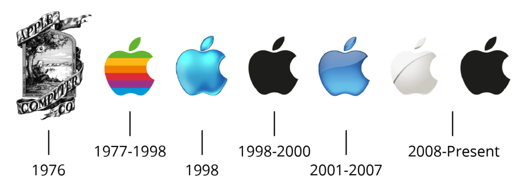
Learning from Tropicana, we know that a memorable brand is a consistent one. Just look at Apple. Their sleek, minimalist design language is instantly recognizable. From the bitten apple logo to the clean lines of their products, everything screams ‘Apple.’ It’s no accident that they’ve built a cult-like following. What we have learned from this giant tech machine is that consistency breeds familiarity, and familiarity breeds trust.
Storytelling: The Heartbeat of a Brand
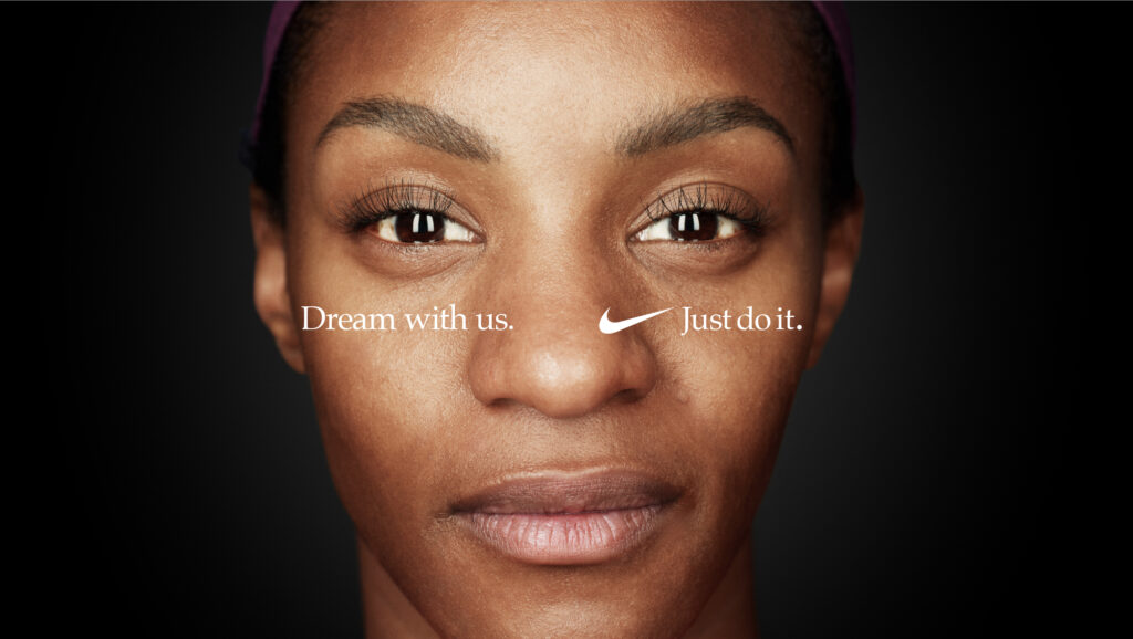
Humans are wired for stories. Brands that weave compelling narratives around their products create deeper connections with their audience. Think about Nike’s “Just Do It” campaign! It isn’t just about selling shoes; it’s about inspiring people to push their limits. Their branding regularly highlights real people’s stories of overcoming adversity, which has become synonymous with their active wear. When you think of Nike, you think of empowerment and winning, and that kind of powerful story can turn a brand into a movement.
The Danger of Blending In
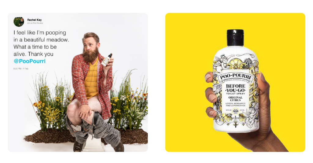
In the crowded market of today, playing it safe is risky. A brand that tries to appeal to everyone often ends up appealing to no one. Think of a company like Poo~Pourri. They carved out a niche by being bold and unapologetically themselves, just check out their hilarious commercials, including the original that made them go viral.
An Olympic-Sized Reinvention
When it comes to global events, few brands are as iconic as the Olympics. Every four years, the IOC adapts their branding to reflect the unique character and flair of the host city (while keeping those five colourful interlocking rings symbolizing the unity and sportsmanship front and center, of course!) From the bold, vibrant look of Rio 2016 to the sleek, tech-savvy vibe of Tokyo 2020 and now to Paris 2024 with a logo that shows off more than meets the eye, Olympic designers are tasked to bring their branding A+++ game. The task is tall – creatively and innovatively evolve a beloved brand yet maintain its legendary status and core legacy. In the complex world of branding, the Olympics is the perfect example of how evolution doesn’t mean losing your essence—it means enhancing it.

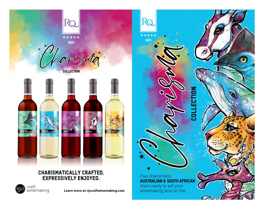
The Charisma of Crafting Creative Branding (with Wine!)
For the past four years, Patch has had the pleasure of collaborating with the fine folks at RJS Craft Winemaking to unveil their premium Restricted Quantities (RQ) collection. They are a dream client, giving us an incredible amount of creative freedom with this lineup of 4-5 specialty wines. We get to build a canvas to weave unique “brand stories” for each selection, deep diving into the taste notes, regions, and terroir of these exceptional wines to craft narratives that resonate with their audience.
Take the 2023 “Charisma” collection, for example. Inspired by wines from Australia and South Africa, we created captivating labels (illustrated by our talented designer, Chelsea!) featuring native animals to the regions whose characteristics mirrored the wines. Our storytelling goes beyond labels—it positions the collection, sparks retailer interest, and drives sales.
From concept to design to social media, we harness our narrative and design expertise to make the RQ collection stand out among the crowd. Utilizing that sweet, sweet creative freedom, we transform each touchpoint of RJS’s winemaking vision into an engaging experience, and that’s the Patch Design guarantee.
Final Thoughts
Not all branding efforts will hit the mark, but that’s okay! The key is to learn from the misses and keep innovating. Here’s one last example to really drive our argument home. Remember when the Gap tried to change its logo in 2010? People were furious and the backlash was swift and brutal. They almost lost the trust they’d built with their audience who widely panned the new look. Luckily, their marketing team listened and they quickly reverted to the old logo, demonstrating the power of listening. If you take anything away from this article, let it be that. Listen to your people and trust in your audience the way they trust in your brand.
Finally, in a marketplace teeming with choices, standing out is your best bet, and our Patch team can help you do that in spades. If you’re looking to take your brand to the next level, let’s talk! We specialize in breathing life, fun and personality into our projects. Our favourite thing is to dig into your story and help it shine. So let’s elevate your brand story together, today!
Recent Comments