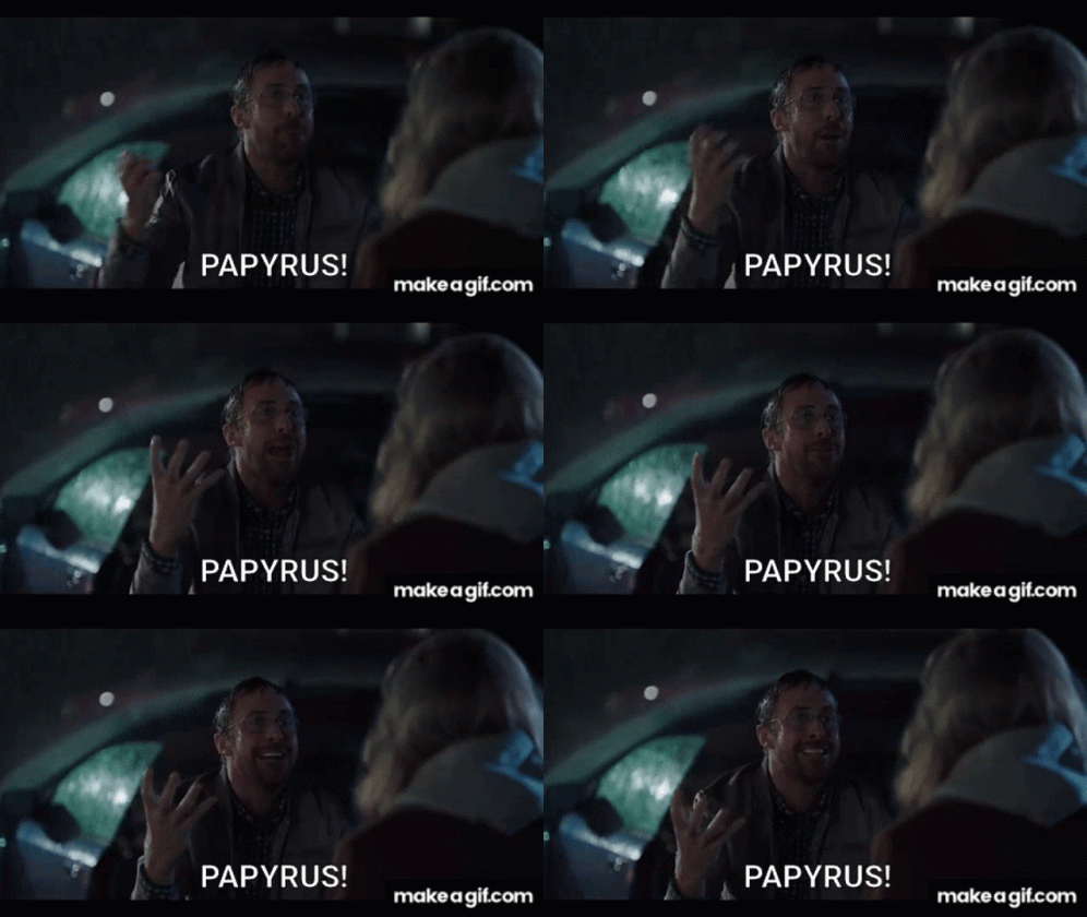
Ah, fonts. Those little lines and curves that, when done right, make your brand look sleek, polished, and ready to conquer the world. But when fonts go rogue, they can cause chaos that even a well-timed meme can’t save. From violating font usage rights to using Papyrus on a massive box-office movie poster (lookin’ at you, Avatar. We still haven’t forgiven James Cameron…), font fails are more common—and more damaging—than you might think.
Let’s dive into the world of typography terrors and how to steer clear of those oh-so-cringey font faux pas.

How very dare you, James Cameron!
The Horror of the Wrong Font Choice
Picture this: you’ve been working tirelessly with a co-worker on a slick presentation to impress a room full of high-level executives. You sent it off for final changes and your colleague sends it back with “just a couple of notes”. You go to open the doc to find ~GASP~ they’ve changed all your beautiful, bold yet simple Montserrat titles to – you guessed it – Comic Sans! Yep, the font that was created to mimic comic book lettering that has become the villain in the professional world is now plastered all over your gorgeous presentation because your co-worker thought it was “more whimsical.”
You scream to the heavens. You cry. You curse Zeus and then you throw up a little, because you know how critical font choice is— it’s more than just squiggly lines on a screen! It sets the tone and conveys trust.

It’s fine. This is fine. Everything is fine.
But don’t worry! You can breathe! This is just a dramatization. No one is using Comic Sans in this article, but it proves how easily the wrong font can turn your “We mean business” message into “We’re not taking this seriously.”
Whether it’s Comic Sans, Papyrus, Chiller, Wonka, Brush Script, Curlz MP (or any other notorious font you can think of), your choice matters more than you think. Fonts shape how your brand is perceived, and while these fonts aren’t inherently bad, context is everything. Knowing when and where to use them is the key to avoiding a typographic disaster.
The Lesson: Fonts are not just about aesthetics—they build trust and convey the right tone with your audience. Choose wisely and find typography that reflects the true personality of your brand, or you might just become the punchline of the internet’s next meme.
When Fonts Cost You More Than Credibility: Legal Pitfalls
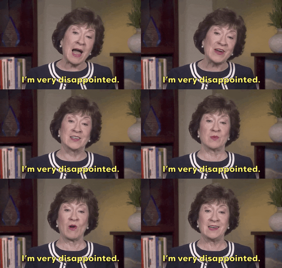
Typography nightmares don’t stop at bad design. Imagine that, after searching through bowels of the internet for hours trying to find the perfect font pairings, you find it! A trendy, expensive-looking typography that fits your brand perfectly—only to remember later that you didn’t purchase the rights. Cue the lawsuit and those dreams you keep having of your mom telling you that she’s disappointed in you!
All jokes aside, it’s true! A lot of folks forget (or simply don’t know!) that fonts can be copyrighted and using them without proper licenses can result in hefty legal fees.
The font world isn’t a free-for-all, and violating usage rights can cost you big time, both in reputation and your wallet. Not every font you see is free to use, so it’s important to ensure your typography choices are not only visually on-point but legally safe.
The Lesson: Always check font licensing. There’s nothing stylish about getting sued!

Web-Safe Fonts: Because No One Wants to Read Wingdings
In the digital age, choosing a web-safe font is critical to ensuring your design is consistent across all platforms and devices. Nothing kills a brand’s vibe faster than discovering that the perfect font you selected isn’t compatible with any good ol’ browser, leading to illegible wingdings or default text (Oh hey, Times New Roman!).
Fonts that don’t render properly on the web can completely derail your design, turning it into a disjointed mess. Even worse, if you’ve worked overtime to create a stunning wireframe and mock-up that your client has fallen head over heels for, you’ve just sold a design that can’t work in real life to a very unhappy client. Not exactly, the grand reveal you had in mind!
And we can’t forget about load times and accessibility! The wrong fancy font can slow things down and might not be readable by everyone—ruining the user experience. When planning for accessibility, choosing a font that is AODA-compliant is key!
The Lesson: Remember, broken text equals broken hearts. Always check to make sure your typefaces are accessible to everyone. The right font can ensure your message is both beautiful and functional.

How Professional Typography Can Elevate Your Brand
Great typography is like a well-tailored suit—it’s subtle, but it makes an impact. The right font can elevate your brand, adding depth, professionalism, and even trustworthiness to your content. Think of brands like Vogue with their iconic, elegant typography or The New York Times with their classic serif. Fonts have the power to tell a story.
Your brand deserves the best, and that starts with professional typography. Done right, fonts can make your business stand out, communicate the right tone, and ensure you’re taken seriously from the first glance.
The Lesson: Fonts are a critical part of your visual identity—invest in the right typography and you’ll elevate your brand in ways you didn’t even realize were possible.

In Conclusion, Leave the Font Nightmares to Us!
At Patch, we believe that great design starts with the details, and fonts are one of the most important ones. If you’ve ever fallen victim to the temptation of using a “quirky” font or gotten lost in the Wild West of font licensing, fear not. We’ve seen it all, and we’re here to help. From selecting the perfect typeface to ensuring it’s used legally; we’ll make sure your brand is saying all the right things—with all the right fonts.
Let’s work together to create typography that tells your story, elevates your brand, and keeps the Comic Sans where it belongs (in the archives).

The assistant to the regional manager knows what’s up when it comes to great typography.

Recent Comments